When it comes to booking experiences, simplicity wins. As competition grows, hoteliers must offer booking journeys that are not only reliable but effortless. With that goal in mind, STAAH’s SwiftBook Booking Engine has rolled out two new enhancements that make the path to booking faster, clearer, and more user-friendly.
Let’s dive into what’s new and how these small tweaks can lead to big improvements in user experience and conversion.
1. New Datepicker Design: Now Clutter-Free
The calendar on a booking engine plays a critical role in driving conversion. But when it’s overloaded with information, rates, restrictions, promotional messages, it can quickly overwhelm users and distract them from their primary goal: selecting travel dates and completing the booking.
What’s Changed?
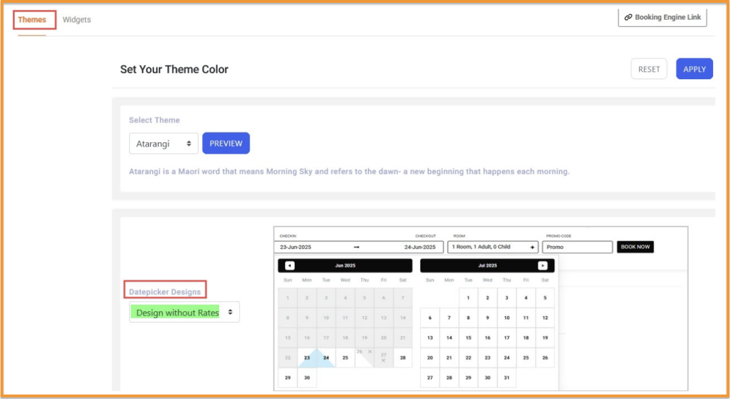
The new datepicker design introduced in SwiftBook strips away the noise. In this cleaner version:
- Rates and restrictions are no longer displayed directly on the calendar.
- Sold-out dates are the only visual indicator, marked simply with an “x”.
This minimal approach improves usability, especially on mobile devices, where screen space is limited. It also supports a wider range of booking behaviors, such as those who are browsing dates based on general availability, not necessarily rate shopping.
How to Enable It?
Properties can configure this feature via the BE Themes module, selecting the updated design from a simple dropdown.

Use Case Example:
Consider a boutique resort that gets a high percentage of mobile bookings. The simplified calendar allows potential guests to browse availability without getting distracted or overwhelmed by rate fluctuations. Once dates are selected, users move to the next step where full rate details are displayed, smoothening the journey and reducing decision paralysis.
2. New Visual Indicator for Sold-Out Dates
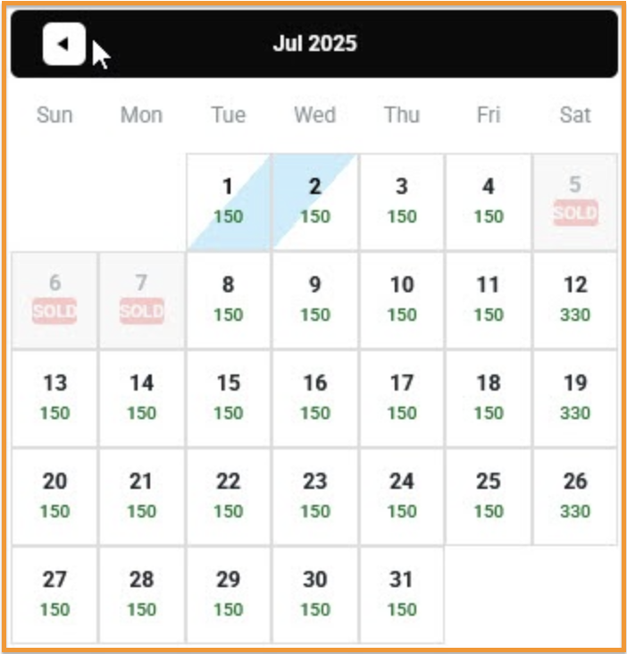
In the earlier version of SwiftBook, dates with no availability were marked as “SOLD”, a label that often confused users. Many interpreted it as the date being entirely unavailable, including for departures.
The New Approach:
- A simple “x” now replaces the “SOLD” label.
- If a date is unavailable for arrival but still valid for departure, it is half-shaded with the “x” placed at the top right.
- This subtly signals partial availability, reducing misinterpretation and guiding users more accurately.
New design indicating dates with no availability

Why It Matters:
This small design change can have a big impact. According to the Baymard Institute, 27% of users abandon online bookings due to a “too long or complicated checkout process,” which often includes confusion around date selection.
By making the availability status more intuitive, SwiftBook ensures guests don’t bounce off due to avoidable UX issues.
Use Case Example:
A city hotel that often has back-to-back check-ins may show high occupancy on certain dates. With the previous “SOLD” label, guests assumed no rooms were available at all. With the updated “x” and half-shade cue, it becomes clear that while arrival may not be possible on that date, checkout is opening up last-minute bookings for stays ending on those dates.
Final Thoughts
Both of these enhancements share a common goal: clarity through design. While subtle, these updates align SwiftBook more closely with UX best practices seen across leading global OTAs, ensuring that your booking engine doesn’t just keep up, but leads.
Ready to simplify your calendar and let guests book with confidence? Head to your BE Themes module and activate the new datepicker design today.

