Hotel websites have a few seconds to grab a prospective guest’s attention. Let’s check-into the latest design trends that can help convert these lookers into bookers.
In the fast paced world that we call home, technology, internet habits and web design trends are constantly changing. The change may be slightly slower in hospitality as compared to some other industries, but it is there for smart hoteliers to pick up and implement to their advantage. In a hyper-competitive environment like hospitality, great design is crucial to improve user-stickiness (how long they stay and what they do on your website).
A good design is typically one that tells the user that they’ve landed in the right place. It lets them know about the experiences your hotel offers and your unique selling point – why should they choose you for their stay. Remember, you have a few seconds to do all this. And, going by internet habits, this would be delivered via a mobile device.
Here are some ways you can make an impact in the limited time and space available.
Bigger, Better Videos
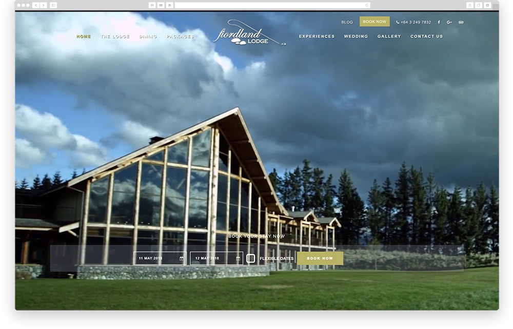
There’s a big shift from embedding generic sales videos on homepage to producing compelling videos with immersive headers as soon as user hits the homepage or other high-level pages. Instead of giving guests a few still photos of each room, guest room tours via video are becoming the order of the day.
Impactful Typography
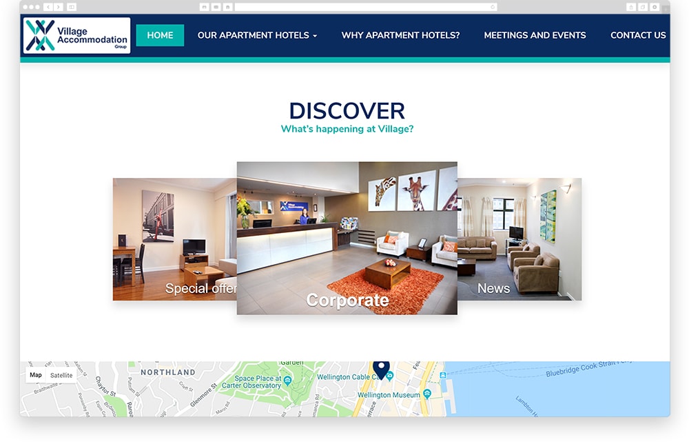
Big, bold lettering never goes out of style. It is one of those trends that seem to just get better and better. Thanks to a growing number of web fonts and compatibility, more designers are taking typography risks with more novelty and interesting typefaces. Mixing it up is the name of the game – no more one font fits all philosophy!
Images: Bolder the Better
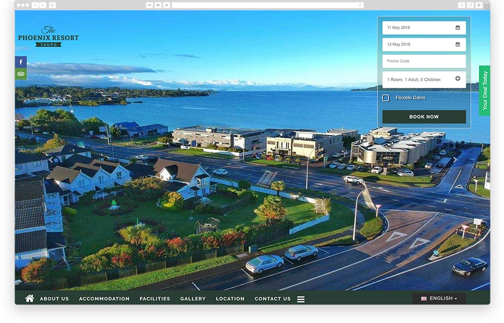
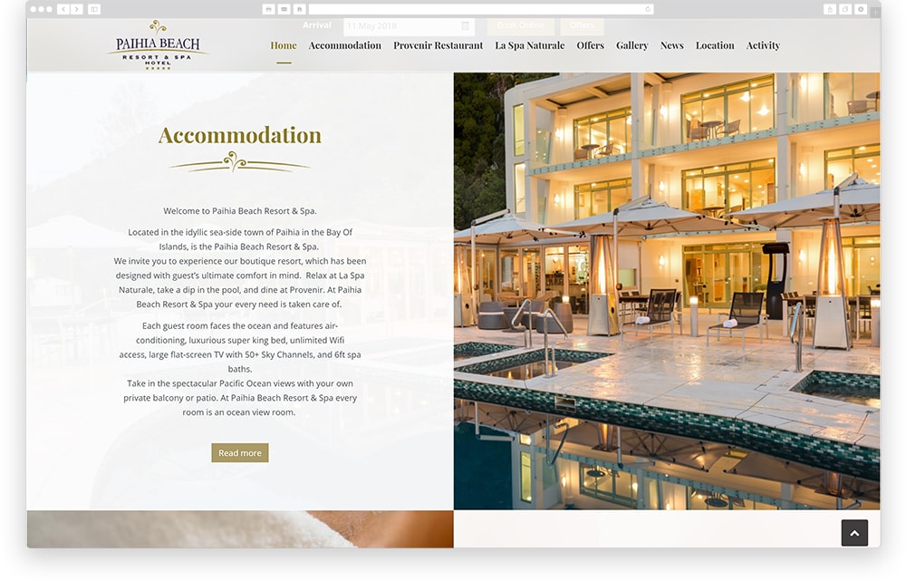
Nothing sells an experience like a good visual. People want to see what your hotel looks like, preferably in a format that allows them to easily envision themselves there. So, we are seeing crowded image galleries being bumped aside for single, supremely large and signature images. Even the image sliders take a back seat to these mesmerising giants.
Use of Animation & Illustrations
Nothing like the brash animations from the eighties, hotel websites today feature ‘non-distracting’ animations to reel users in. Subtle hero videos are an example of this. Illustrations and icons are being seen to inject some fun into the site as well as for navigation and focusing on site content.
Let Them Scroll
Scrolling, when done right, gives visitors just enough content to satiate their curiosity but not so much that they feel overloaded. This is certainly a by-product of social feeds and continued shift to mobile. Bear in mind that the scroll should be such that visitors can consume your homepage in 15 seconds or less.
