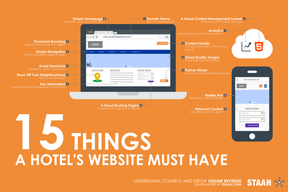
Your hotel’s website is its face on the internet. If it doesn’t do a good enough job, it is more than likely that your prospects will choose your competition over you. Here are top 15 easy to implement tips to keep in mind when designing your hotel’s website.
1. Domain Name
Have an easy to remember domain name, one that includes your hotel’s name. This makes it a lot easier for your prospects and search robots to find your website.
2. Place Contact Details at the Top
Most searches are happening on a smartphone (more than 50% according to Google). And it is very likely that someone searching for you has a query or booking. So keep your contact details at the top for people to find this information. Making it in a call-to-click format also makes it easier for the user.
3. Keep the Brand Prominent
Don’t bury your logo and name – your identity – in scrolls of text or at the bottom of the page. Keep this information at the top of the page – it’s a great visual connect for someone who is coming to your site from a web page full of listings (eg. OTA). Do away with a tagline unless it really address to your unique proposition.
4. Go Mobile
Mobile-friendly sites are not just a “good to have” anymore. They are a must. You’ll be penalised by your users and search engines for not having one.
5. Simplicity of Navigation
Booking in the travel and hospitality industries can be a painful experience. Making a site’s navigation feel as effortless as possible is one way to make people follow through with the booking on your own site. It’s better for your SEO too. Keep in mind mobile menu drop downs that cannot be too long so it is best for your main navigation menu to have key information for conversion – contact forms, offers, USP, booking page. Don’t make it hard to find the booking buttons.
6. Invest in Good Quality Images and Videos
Good quality images (both resolution and styling) and short videos are a fantastic way for your prospects to experience your hotel. Try to have seasonal shots of your property and updates photos of the services and dining experiences you offer. You can harvest social or user generated content as long as quality is not compromised and rights obtained. Place these images in hero sliders at the top of the page to make an impact. When embedding videos on your website from YouTube, remember to remove the Suggested Videos option – you don’t want your hard earned user moving away from your site.
At the same time, make sure those images should be light-weight, otherwise it will slow down your website loading speed and the visitors will exit immediately.
7. Above the Fold Information
Real estate on a web page, especially on mobile, is scarce. A good website design will feature the most relevant information above the fold. This includes your contact details, images or videos, offers and booking button. That said, don’t cram up the top.
8. Simple Homepage
Don’t clutter your homepage – or any page for that matter. Provide only relevant information and in easily digestible bits. Remember you’re dealing with a fickle web audience and have only a few seconds to sell them your story and convert.
9. Relevant Content
Write content first for the user and then for the search engines. Use keywords wisely as well as internal links. Customer reviews should be a big part of your content, so should deals and special events. Have diverse call-to-actions; not everyone is coming to your website for a booking. Formatting your content so it is easy to read on any screen is also a must – use an easily readable font, sub headings and bullet points. Downloadable PDFs are a big no-no; they take time to download, use up precious data and are hard to read.
10. Invest in a Good Booking Engine
Don’t make your customer jump through hoops when booking online. Ensure that you have an easy to use and secure booking engine. Make sure it complies with the requirements of the Payment Card Industry Security Standards Council (PCI DSS).
11. Analytics
Be it the booking engine or site statistics, it is important to understand the insights. They are very helpful while marketing your hotel to grow your online revenue.
12. Avoid Flash Animations, Music, Fancy Cursors or Moving Text
They are annoying and slow down load time.
13. Have an Easy and Flexible Content Management System
Digital is a fast moving platform. The only constant is change and you should be able to adapt your website to these changes quickly and efficiently.
14. Show off Your Location
Is your property in the heart of the city? Or does it lie in a serene rural set-up? Let the travellers see what they’ll enjoy in and around your property when they stay with you through well-placed images and related content.
15. Choose Your Website Designer/Platform Wisely
It can be hard enough managing your property on some days without the added burden of fixing a broken website, let alone the loss of revenue. Choose your website partner wisely. You want someone who is respected, knows the industry and is available 24×7 to help fix any issues.
